This page introduces the main areas of the LabMaestro user interface. After reading this page, you will know:
-
What each panel and workspace is used for.
-
How the Configure and Build layouts differ.
-
How to customize the interface to suit your workflow.
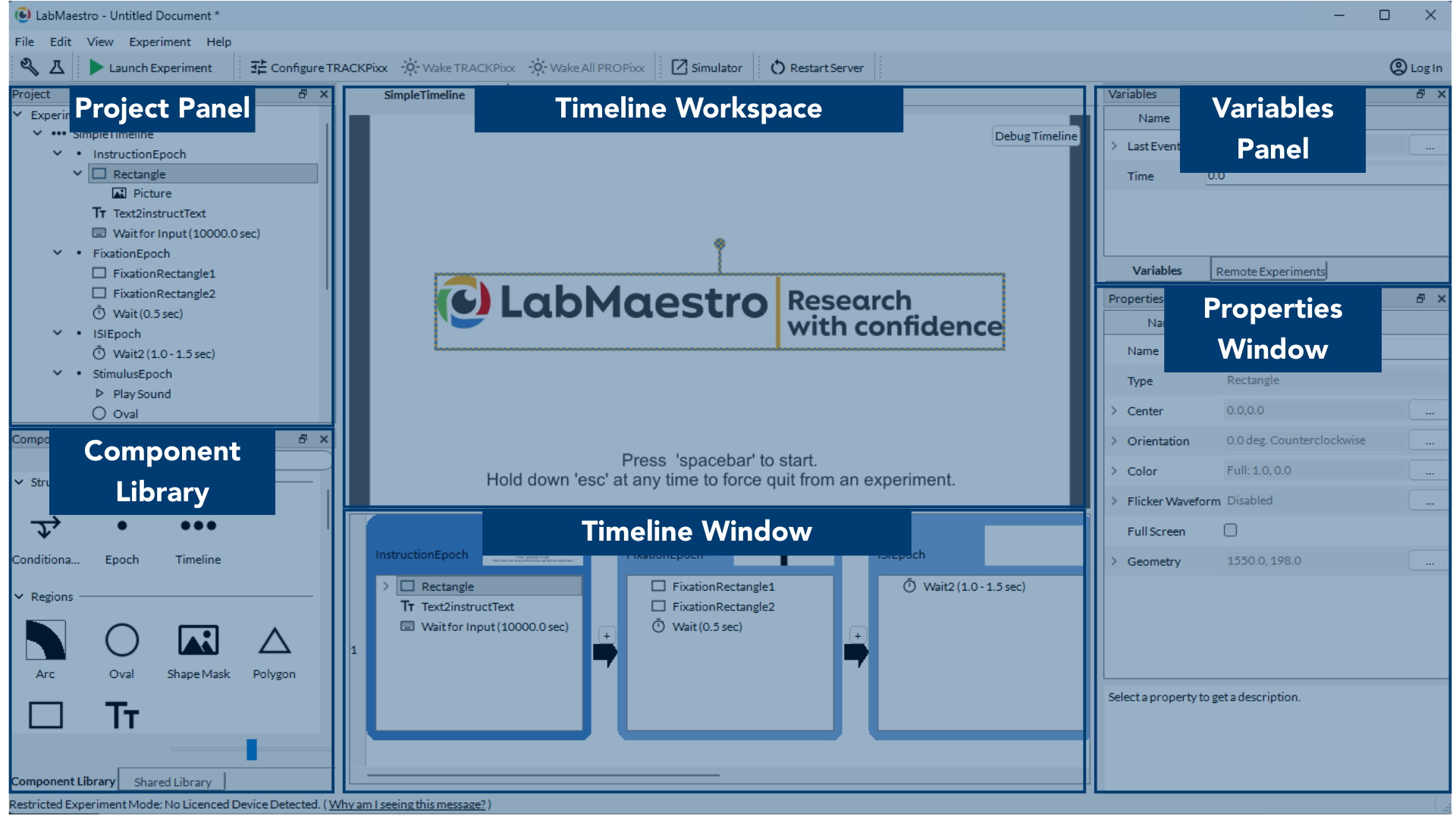
The main LabMaestro window is divided into six key areas, labelled in the screenshot above. These regions work together to help you organise projects, build timelines, and inspect data. Each region is described in detail below. A section at the end of the page explains the differences between Configure and Build views, as well as view customization.
Project Panel
The Project Panel shows a summary of the currently open LabMaestro project (stored in a .lm project file).
From here, you can access:
-
Experiment Design -- The timelines, components, and logic that define your experiment.
-
Environment -- The hardware detected by LabMaestro, including displays and all VPixx devices with an I/O system.
-
Hardware that is detected and associated with the project appears in black text.
-
Hardware that is detected but not associated with the project appears in light grey text.
-
Hardware that is not detected but is associated with the project appears in red text.
-
-
Resources -- Any media files associated with the project.
-
Recordings -- Any data recorded during current and previous project sessions.
Use this panel as the starting point to open, inspect, and manage all content associated with a project.
Component Library
The Component Library lists all of the building blocks you can add to your timelines. Components include:
-
Visual and auditory stimulus generators
-
Input and response collection tools
-
Eye-tracking start/stop and configuration components
-
Utility components for controlling flow and timing
Drag a component from the library into an epoch to create a new instance with default property values. You can then customise that instance using the Properties Window.
Shared components are components contributed by community users and hosted on the LabMaestro online portal. Shared components added by the user appear in the Shared Library tab.
Timeline Workspace
The Timeline Workspace is a static preview of the selected epoch. It shows what will appear on screen during that epoch, including images, gratings, text, and other visual components.
-
You can drag, drop, move, and resize certain components directly within this workspace.
-
When you adjust a component here, its properties update automatically, and the change is reflected in the corresponding component inside the Timeline Window.
-
In 3D video modes, the preview includes a control that lets you toggle between left-eye and right-eye views.
Debug Timeline launches a windowed or fullscreen preview of the experiment on the same monitor as the LabMaestro interface. Press the Escape key to exit this preview.
Timeline Window
The Timeline Window is where you build and edit your experiment logic.
-
A timeline is made of epochs, arranged left to right.
-
Within an epoch, components are processed top to bottom. Some execute simultaneously.
-
An epoch is a container that groups related components (e.g., fixation, stimulus presentation, response collection).
-
Each epoch header includes a thumbnail preview that reflects the visual components it contains.
Variables Panel
The Variables Panel lists variables that are available in the currently selected timeline, along with their current values in the editor.
-
Variables can be global (e.g.,
Time) or local to a method or timeline. -
These values are used inside the editor and preview tools, especially when building expressions that drive component properties.
-
Values shown here are not stored permanently and do not persist at runtime; they serve as a reference while you build and test your experiment.
Use the Remote Experiments tab in this pane to access LabMaestro projects running in the Pack&Go interface.
Properties Window
The Properties Window shows the editable settings for whichever component is currently selected.
Typical examples:
-
For a visual region: size, position/centre, rotation, colour, timing.
-
For an input component: device selection, button mapping, timeouts.
A text field at the bottom of the Properties Window displays the description and options for the currently selected property.
Configure vs. Build Layouts
The screenshot above shows the Build layout, accessed by clicking the beaker icon 🧪 in the top left of the interface. The Configure layout hides Build-oriented panels for a streamlined hardware management experience. Access this view by clicking the wrench icon 🔧 in the top left corner.
Customizing Your Interface
You can toggle which panels appear in the interface by selecting them from the View menu:
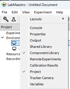
Panels appear in default locations and can be popped out as separate windows, closed, resized, or dragged to different positions for a customized layout.
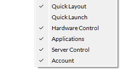
You can also customise the secondary menu by checking or unchecking items in the bottom section of the View menu.