Overview
This page details the built-in data visualization tool included in LabMaestro. These allow you to quickly review a participant’s results after an experimental session. Clicking the data file opens the data visualization window.
Before you begin, you should:
-
Have LabMaestro installed and activated
Method Data Visualization
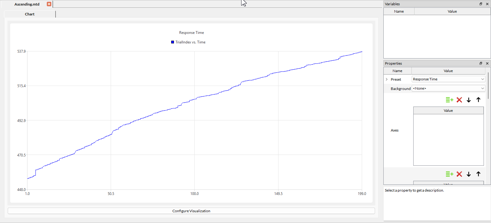
Let us first consider a *.mtd file containing information from a staircase experiment. By default, when opening the .mtd file, a plot showing the time each answer was recorded for each trial is displayed.
By defining properties, you can visualize the data stored in the data file. The same plotting tools are used for Digital, Analog and Tracker recordings.
Properties include:
Preset
Select among preset data plots. Presets include graphs relevant to your method, such as an overview of the staircase run when using a staircase method.
As of Version 1.12, a new preset showcasing performance metrics has been added. This allows you to see, at a glance, how many frames were dropped on each individual trial of your experiment.
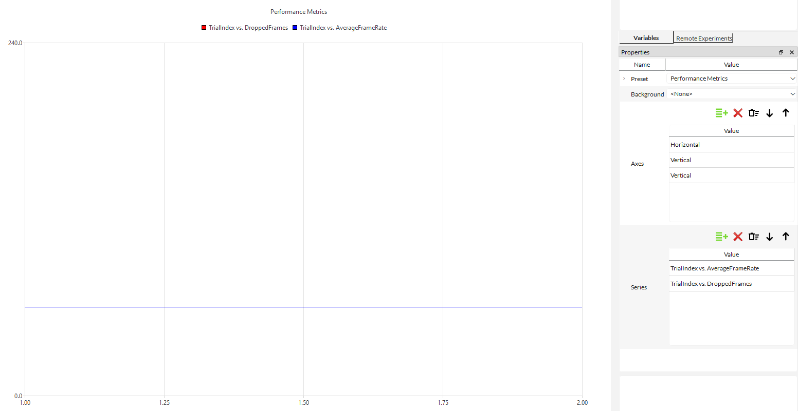
For a summary of global performance, you can click on the session and see the average frame rate of the experiment, as well as the number of dropped frames.
Background
You can load a background image from Resources, and LabMaestro will overlay the data on it. This can be useful for mapping fixation data onto a sample stimulus.
Axes
Define the properties of axes. Axes have the following properties:
-
Name: Name of the axis.
-
Automatic: Toggle on to automatically scale the axis limits to the variable.
-
Alignment: Define the axis position. Can be Bottom, Top, Left or Right.
-
Show: Toggle on to make this axis visible.
-
Unit: Define the data unit to be displayed on the plot next to the axis.
Series
Allows you to control what data to display on your graph and how to present it. For each data series defined, you can change the following properties:
-
Name: The name of the data series. Used in the legend to identify different data series.
-
Representation: How to plot your data series; can be a line, scatterplot or spline interpolation.
-
Horizontal Dimension: Define what variable to plot on the horizontal axis.
-
Vertical Dimension: Define what variable to plot on the vertical axis.
-
Color: Define the colour used to represent this data.
-
Opacity: Define the level of opacity for this data.
-
Hidden: Toggle on to hide this data in your graph.
-
IsDigitalSignal: Toggle on to define this data as a digital signal.
-
Where: Define a Boolean condition to determine…
-
Border: Define a border colour for this data.
-
Marker: Define the marker type used in a scatter plot.
-
Step Size: Define the step size for selected data points. 1 (default) will show all data points.
-
Horizontal Multiplier: Multiply all values of the horizontal variable by the defined value.
-
Vertical Multiplier: Multiply all values of the vertical variable by the defined value.
-
Horizontal Axis: Select an axis defined in the Axes property as the horizontal axis.
-
Vertical Axis: Select an axis defined in the Axes property as the vertical axis.
For an example visualization of method data obtained from an experiment, please see the Contrast Sensitivity template experiment.
Eye Tracking Data Visualization
When visualizing eye tracking data, in addition to the standard plotting tools described above, you also have the option to visualize data as a heatmap, with the following properties:
-
Gradient: Select the preferred gradient for the heatmap.
-
Background Image: Select a background image on which LabMaestro will overlay data.
-
Bin Sizes: Define the preferred bin size.
-
Square Bin Sizes: Toggle on to enable square bin sizes.
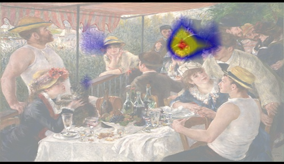
For an example visualization of Eye Tracking data obtained from an experiment, please see the Free Viewing and Saccade to Target template experiments.
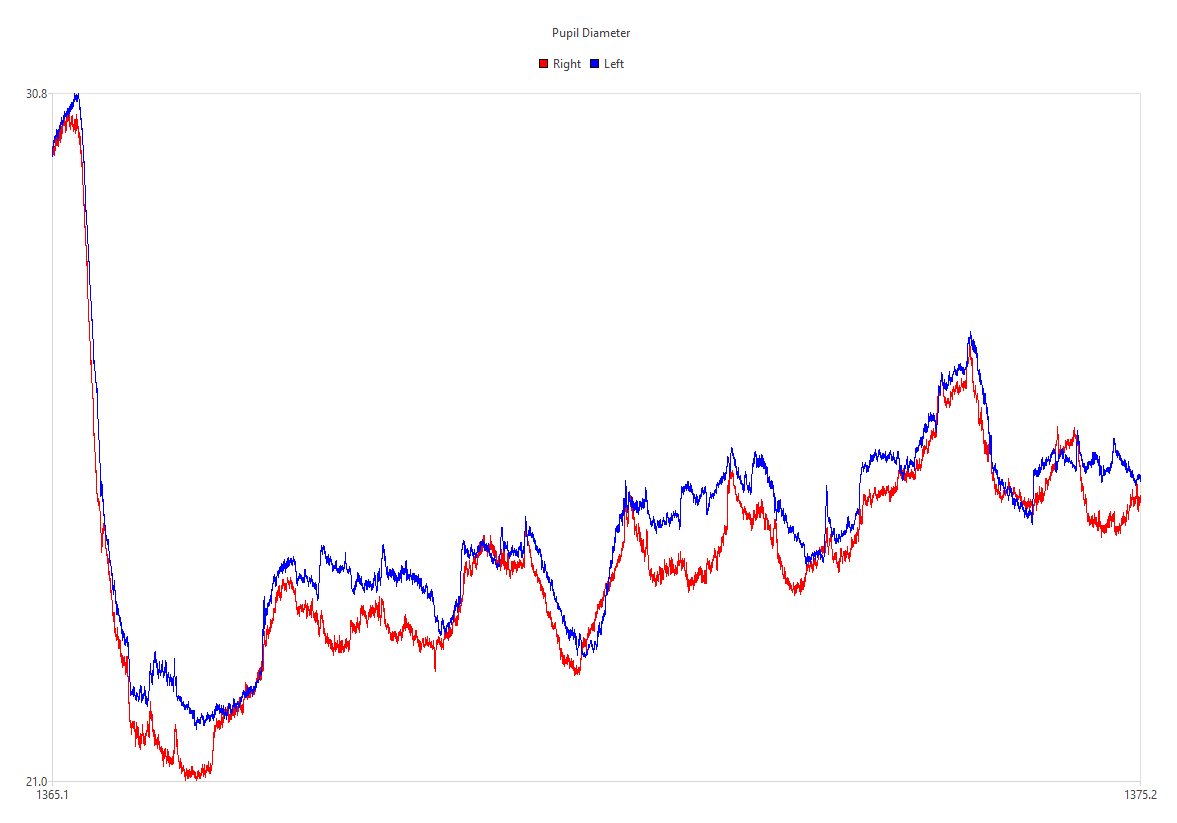
As of Version 1.12, a new preset was added to draw pupil diameter as a function of time.